Design Studio
Approach:
Conducted stakeholder interviews with doctors, front desk staff, and IT leads to understand key workflow breakdowns.
Interviewed patients across age groups to map real-world experiences using the app for the first time in-clinic.
Performed a UX audit of the existing interface to assess its alignment with accessibility and usability standards.
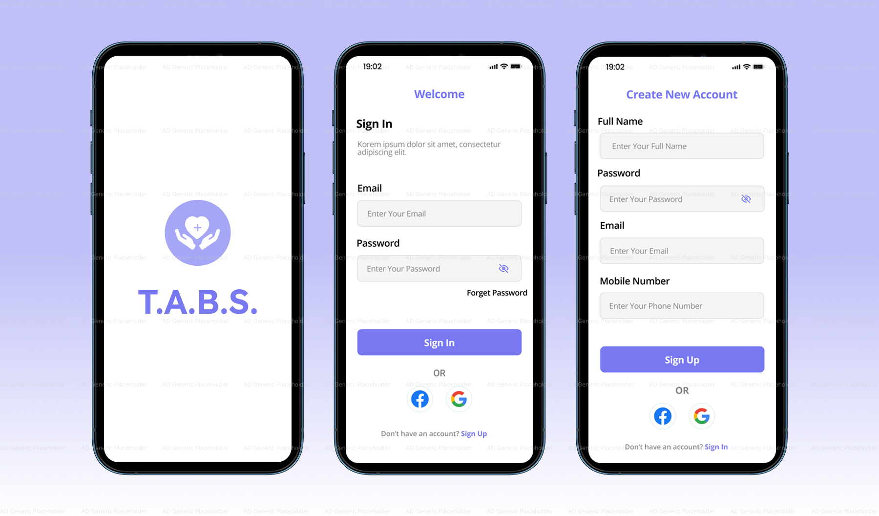
Redesigned the onboarding flow to include simple progress indicators, visual aids, and contextual tooltips.
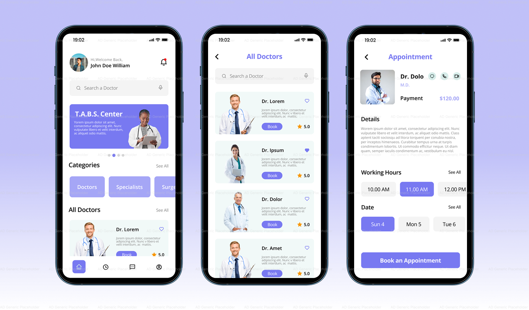
Created a modular system for intake forms that allowed patients to complete their check-in in digestible, guided steps.
Rebranded the UI with a friendlier tone, updated iconography, and visual consistency with the healthcare network’s brand system.
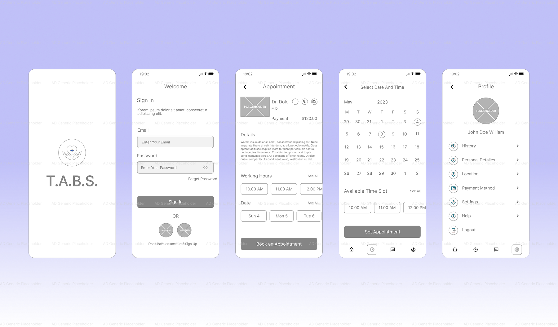
Tested prototypes with a mix of returning patients and clinical staff, collecting feedback across two design iterations.
Developed an onboarding kit for front desk staff to use when introducing the app to new patients.
Outcome: After launch of the redesigned T.A.B.S., clinics saw a marked improvement in patient check-in efficiency and staff satisfaction:
Patient form completion rates increased by 52% in the first 60 days.
87% of staff reported they felt “more comfortable” teaching patients how to use the app post-redesign.
Average pre-visit check-in time decreased by 3.5 minutes per patient.
Patients noted greater clarity and ease of use, particularly in the restructured intake flow.
Unfortunately, despite the positive results, T.A.B.S. was later deprecated due to shifts in funding and a broader platform consolidation initiative by the healthcare group. Still, the lessons from its UX transformation lived on—many design principles from the updated T.A.B.S. were absorbed into other tools across the network.
Overall: T.A.B.S. started as a well-meaning but underperforming tool, caught between clinical ambition and real-world usability. Through research-driven UX work and collaboration with both patients and healthcare staff, the app evolved into a reliable pre-visit assistant that genuinely improved the care journey. Though the project was sunset, it stands as a case study in how even short-lived tools can make a long-lasting impact when designed with empathy and clarity.